In the dynamic realm of smartphone technology, customization options have long been a battleground for loyalty among users. Historically, Android has reigned supreme in this domain, offering a plethora of personalization features that allow users to tailor their devices to their unique preferences. Apple, known for its more controlled ecosystem, has taken a gradual approach to introducing customization capabilities on iPhones. However, the upcoming iOS 18 marks a significant shift in Apple’s stance, signaling a new era where iPhone users can enjoy greater flexibility akin to that of Android’s.
iOS 18: Bridging the Customization Gap
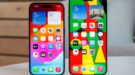
The announcement of iOS 18 brings with it an eagerly awaited feature— the ability to add blank spaces on the iPhone’s Home Screen. While seemingly minor, this addition is emblematic of Apple’s evolving philosophy towards iOS customization. For years, the rigid structure of iPhone’s Home Screen has been a point of contention for users seeking a more personalized and less cluttered interface. The introduction of blank spaces in iOS 18 addresses this, allowing users to organize their apps more creatively and logically, thereby enhancing the overall aesthetic and functionality of their device.
A Comparative Look at Android’s Flexibility
Android platforms, particularly Samsung’s One UI, have long offered a level of customization that iPhone users could only dream of. From altering app icon sizes and colors to employing third-party launchers for an entirely revamped interface, Android has set the benchmark for smartphone personalization. This freedom to customize has not only been a key selling point for Android but also a source of envy among iPhone users constrained by iOS’s limitations.
The Significance of iOS 18’s Customization Features
Apple’s decision to incorporate more customization options into iOS 18, starting with the ability to create blank spaces, is more than just an update; it’s a testament to Apple’s commitment to user satisfaction and its recognition of the importance of personalization. By taking a page from Android’s playbook, Apple is not only enhancing the iPhone experience but also addressing long-standing user requests for greater control over their devices.
Android’s Influence and Apple’s Strategic Shift
The influence of Android’s customization capabilities on Apple’s strategic direction cannot be understated. As Apple introduces features like blank spaces in iOS 18, it acknowledges the competitive edge that flexibility offers. This move also reflects Apple’s understanding that personalization is not just about aesthetics but about how users interact with their devices on a daily basis. It’s a shift towards embracing the diversity of user preferences and the myriad ways in which people use their phones.
Looking Forward: What’s Next for iPhone Customization?
While iOS 18’s new feature is a step in the right direction, it also opens the door to speculation about what future updates might hold. Will Apple continue to expand its customization options, perhaps eventually offering the same level of flexibility as Android? Only time will tell, but for now, iOS 18 represents a promising move towards a more personalized iPhone experience.
In conclusion, as Apple rolls out iOS 18 with its enhanced customization features, it not only narrows the gap with Android but also sets the stage for a more user-centric approach to smartphone personalization. This development is a clear indication that Apple is attentive to user feedback and is willing to evolve its ecosystem to meet the diverse needs of its customer base. With this update, iPhone users can look forward to a more tailored and enjoyable mobile experience, heralding a new chapter in the ongoing evolution of iOS.





Add Comment