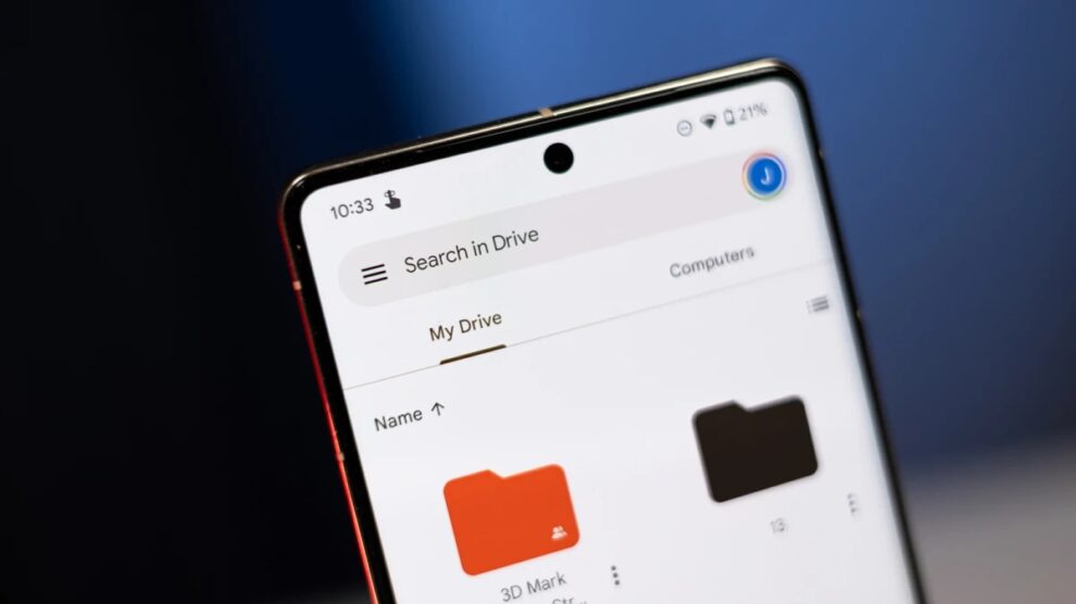
Google Drive enthusiasts, rejoice! The widely-used file storage and sharing platform are undergoing a significant transformation, with a revamped homepage making its way to Android and iOS users. Let’s dive into the details of this exciting update.
Streamlined File Discovery
Say goodbye to file-searching woes. The new homepage introduces a list view, offering a condensed yet comprehensive display of relevant files and documents. This enhancement ensures that users can quickly and efficiently locate the files they need, enhancing overall productivity.
Introducing the Card View
Adding a visual flair, the card view on the new homepage highlights items requiring your attention. From pending access requests to recent comments and awaiting approvals, this feature keeps you informed and organized. It’s more than a homepage; it’s your dynamic dashboard for Drive activities.
The Activity View: A Glimpse of Your Drive’s Pulse
Stay in the loop with the newly introduced Activity view. This feature provides a chronological list of recent activities within your Drive – creations, edits, and shared files. It’s your one-stop destination to track Drive events and ensures you never miss a beat.
Google Drive’s Evolution: More Than a Facelift
The redesigned homepage and Activity view join a parade of recent updates on Google Drive. Notable additions include offline mode file viewing and editing, precise file sharing options, and enhanced file security through password protection.
Pros of the Google Drive Homepage Redesign
Easier File Retrieval
With the list and card view, finding files becomes a breeze, promoting a seamless user experience.
Visual Appeal
The redesign prioritizes aesthetics, making your Drive interactions more visually engaging and appealing.
Efficient Space Utilization
Optimized layouts ensure that every inch of your screen contributes to a more productive workspace.
Customization Options
Tailor your Drive experience with more customizable features, putting you in control of your digital workspace.
Cons to Consider
Adaptation Period
The new design might require users to acclimate, posing a slight learning curve for some.
User Efficiency Variability
While the redesign is an improvement for many, individual preferences may affect how efficiently users adapt.
Customization Limitations
Some users may find that the redesign limits certain customization options, depending on their specific needs.
The Verdict: Embracing Progress
In the grand scheme, the Google Drive homepage redesign is a positive evolution. Its focus on enhancing user experience, improving aesthetics, and optimizing space utilization demonstrates Google’s commitment to staying ahead in the digital workspace arena. While some users may need time to adjust, the long-term benefits far outweigh the initial learning curve.
The Google Drive of today is not just a storage solution; it’s a dynamic and user-centric platform. Embrace the change, explore the new features, and rediscover the efficiency of managing your digital files. Google Drive continues to be a versatile and indispensable tool for users across various platforms, and the latest updates only reinforce its standing as a leader in cloud-based file management.
Have questions or thoughts about the Google Drive redesign? Feel free to share your insights. Let’s navigate this digital transformation together.


Add Comment